Teleste logos for media use.
One of the central elements of Teleste’s identity is its logotype. This page explains how to use the logotype in your communications – what colours it can appear in, what clear space is needed and how the logotype is used with or without a logo field.
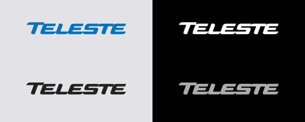
Logotype colours
The primary colour choice for the logotype is always Teleste Blue. If the Teleste Blue colour cannot be used, other variations of the logotype is also available. Please note that the Teleste logo should not be placed over Sky Blue or Bright Yellow due to visibility issues.
- Blue logo – The primary logo is always Teleste Logo Blue.
- White logo – The secondary logo should be used when the logo is placed on a dark background.
- Black logo – A black logo should only be used for black and white material. The black logo may appear on a white or a light grey surface.
- Light grey logo – A light grey logo is only allowed to be used on printed materials, such as black t-shirts or other dark materials, when a blue logo is not visible enough or a white logo is too strong in contrast.
Size
The minimum size for the logo in print and web use is 30 mm / 85 px.
Clear space
Clear space has been established around our Logo to protect its integrity.
The Teleste logo must always be surrounded by clear space on all sides to protect its integrity. This ensures that the logo is never visually dominated by other elements. The defined clear space should be kept clear of all type, graphic elements, lines and illustrations.
The clear space is in direct proportion to the size of the logo. Vertically, the minimum clear space around the logo is equivalent to the height of the letter T. Horizontally, the clear space is the width of the letter T. Please find below an example: